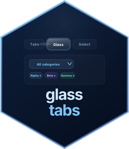
Animated glass-morphism tab navigation and multi-select filter widgets for R Shiny

glasstabs provides animated Shiny widgets built around a glass-morphism aesthetic:
glassTabsUI() — an animated tab bar
with a sliding glass halo that follows the active tabglassMultiSelect() — a multi-select
dropdown with three selection styles, live search, tag-pill syncing, and
server-side update supportglassSelect() — an animated
single-select dropdown with optional search, clear support, theming,
selection styles, and server-side update supportAll widgets are self-contained, fully themeable, and work in plain
fluidPage(), bs4DashPage(), or any other Shiny
page wrapper.
Full documentation: https://prigasg.github.io/glasstabs/
# From CRAN
install.packages("glasstabs")

# From GitHub (development version)
pak::pak("prigasG/glasstabs")
# or
devtools::install_github("prigasG/glasstabs")library(shiny)
library(glasstabs)
ui <- fluidPage(
useGlassTabs(),
glassTabsUI(
"main",
glassTabPanel(
"t1", "Overview", selected = TRUE,
h3("Overview"),
p("Content here."),
glassFilterTags("cat")
),
glassTabPanel(
"t2", "Details",
h3("Details"),
p("More content."),
glassFilterTags("cat")
),
extra_ui = glassMultiSelect(
"cat",
c(A = "a", B = "b", C = "c"),
show_style_switcher = FALSE
)
),
verbatimTextOutput("info")
)
server <- function(input, output, session) {
tabs <- glassTabsServer("main")
filt <- glassMultiSelectValue(input, "cat")
output$info <- renderPrint({
list(
active_tab = tabs(),
selected = filt$selected(),
style = filt$style()
)
})
}
if (interactive()) shinyApp(ui, server)Note:
useGlassTabs()must be called once somewhere in the UI before anyglassTabsUI()orglassMultiSelect()call. It injects the shared CSS and JavaScript as a properly deduplicatedhtmltoolsdependency.
| Function | Description |
|---|---|
useGlassTabs() |
Inject package CSS and JavaScript — call once in the UI |
runGlassExample(example) |
Launch a built-in example app (runGlassExample() to
list all) |
glasstabs_news() |
Print the package changelog to the R console |
| Function | Description |
|---|---|
glassTabsUI(id, ..., selected, wrap, compact, extra_ui, theme) |
Animated tab bar with content area; compact=TRUE for
dashboard cards |
glassTabPanel(value, label, ..., icon, selected) |
Define one tab and its content; icon accepts
shiny::icon() |
glassTabsServer(id, bookmark) |
Reactive returning the active tab; bookmarks active tab in URL |
glassTabsOutput(outputId) |
UI placeholder for a server-rendered tab widget |
renderGlassTabs({expr}) |
Render a glassTabsUI() reactively; JS reinitialises
automatically |
glassTabCondition(id, value) |
JS condition string for conditionalPanel() |
updateGlassTabsUI(session, id, selected) |
Switch the active tab from the server |
updateGlassTabBadge(session, id, value, count) |
Set a numeric badge on a tab button (0 hides it) |
showGlassTab(session, id, value) |
Show a hidden tab |
hideGlassTab(session, id, value) |
Hide a tab from the navigation bar |
disableGlassTab(session, id, value) |
Gray out a tab (stays visible, not clickable) |
enableGlassTab(session, id, value) |
Re-enable a disabled tab |
appendGlassTab(session, id, tab, select) |
Add a new tab at runtime |
removeGlassTab(session, id, value) |
Remove a tab at runtime |
glass_tab_theme(...) |
Custom colour theme for glassTabsUI() |
| Function | Description |
|---|---|
glassMultiSelect(inputId, choices, ...) |
Multi-select dropdown widget |
updateGlassMultiSelect(session, inputId, ...) |
Update multi-select choices, selection, or style |
glassMultiSelectValue(input, inputId) |
Reactive helper for multi-select value and style |
glassSelect(inputId, choices, ...) |
Single-select dropdown widget |
updateGlassSelect(session, inputId, ...) |
Update single-select choices, selection, or style |
glassSelectValue(input, inputId) |
Reactive helper for selected value |
glassFilterTags(inputId) |
Tag-pill display area synced to a multi-select |
glass_select_theme(...) |
Custom colour theme for glassSelect() and
glassMultiSelect() |
| Input | Type | Description |
|---|---|---|
input[["<id>-active_tab"]] |
character |
Currently active tab value from glassTabsUI() |
input$<inputId> |
character vector |
Selected values from glassMultiSelect() |
input$<inputId>_style |
character |
Active selection style from glassMultiSelect() |
input$<inputId> |
character or NULL |
Selected value from glassSelect() |
Use glassTabCondition() to avoid constructing the input
key manually:
# Instead of: condition = "input['main-active_tab'] === 'details'"
conditionalPanel(
  condition = glassTabCondition("main", "details"),
  p("Only visible on the Details tab.")
)

# Inside a module — pass the same id as glassTabsUI():
# glassTabsUI(ns("tabs"), ...)
# conditionalPanel(condition = glassTabCondition(ns("tabs"), "details"), ...)library(shiny)
library(glasstabs)
choices <- c(
Apple = "apple",
Banana = "banana",
Cherry = "cherry"
)
ui <- fluidPage(
useGlassTabs(),
glassMultiSelect("fruit", choices),
glassFilterTags("fruit"),
verbatimTextOutput("out")
)
server <- function(input, output, session) {
output$out <- renderPrint(input$fruit)
}
if (interactive()) shinyApp(ui, server)Note: By default,
glassMultiSelect()starts with all choices selected.
server <- function(input, output, session) {
  observeEvent(input$clear, {
    updateGlassMultiSelect(
      session,
      "fruit",
      selected = character(0)
    )
  })

  observeEvent(input$fill_style, {
    updateGlassMultiSelect(
      session,
      "fruit",
      check_style = "filled"
    )
  })
}```{r single-select} library(shiny) library(glasstabs)
choices <- c( North = “north”, South = “south”, East = “east”, West = “west” )
ui <- fluidPage( useGlassTabs(), glassSelect( “region”, choices, clearable = TRUE, check_style = “checkbox”, theme = “light” ), verbatimTextOutput(“out”) )
server <- function(input, output, session) { output\(out <- renderPrint(input\)region) }
if (interactive()) shinyApp(ui, server)
## Server-side updates

```r
server <- function(input, output, session) {
  observeEvent(input$pick_south, {
    updateGlassSelect(
      session,
      "region",
      selected = "south"
    )
  })

  observeEvent(input$clear_region, {
    updateGlassSelect(
      session,
      "region",
      selected = character(0)
    )
  })

  observeEvent(input$fill_region, {
  updateGlassSelect(
    session,
    "region",
    check_style = "filled"
  )
})
}All widgets default to "dark". You can switch to
"light" or supply a custom theme object.
# Tab widget
glassTabsUI(
  "nav",
  glassTabPanel("a", "A", selected = TRUE, p("Content")),
  theme = glass_tab_theme(
    halo_bg = "rgba(251,191,36,0.15)",
    tab_active_text = "#fef3c7"
  )
)

# Multi-select
glassMultiSelect(
  "filter", choices,
  theme = glass_select_theme(
    mode = "dark",
    accent_color = "#f59e0b"
  )
)

# Single-select
glassSelect(
  "region", choices,
  theme = glass_select_theme(
    mode = "light",
    accent_color = "#2563eb"
  )
)

# Built-in light preset
glassTabsUI("nav", theme = "light", ...)
glassMultiSelect("f", choices, theme = "light", ...)
glassSelect("s", choices, theme = "light", ...)
glass_tab_theme()
handles| Argument | Controls |
|---|---|
tab_text |
Inactive tab label color |
tab_active_text |
Active tab label color |
halo_bg |
Sliding glass halo fill |
halo_border |
Sliding glass halo border |
content_bg |
Tab content panel background |
content_border |
Tab content panel border |
card_bg |
Inner card background |
card_text |
Inner card text color |
glass_select_theme()
handles| Argument | Controls |
|---|---|
mode |
Base preset, either "dark" or "light" |
bg_color |
Dropdown panel and trigger background |
border_color |
Border color |
text_color |
Main text color |
accent_color |
Ticks, badges, checked states, and clear controls |
label_color |
Optional field label color |
glassMultiSelect() and glassSelect()
support three selection indicator styles:
| Style | Appearance |
|---|---|
"checkbox" |
Ghost box with animated tick |
"check-only" |
Tick only, no box |
"filled" |
Solid colored box with no tick |
glassMultiSelect(
  "f", choices,
  check_style = "filled",
  show_style_switcher = FALSE
)

glassSelect(
  "s", choices,
  check_style = "check-only"
)
Hues distribute automatically around the color wheel or can be set manually under multi-select:
glassMultiSelect("f", c(Apple = "apple", Banana = "banana", Cherry = "cherry"),
  check_style = "filled",
  hues = c(apple = 10L, banana = 50L, cherry = 340L)
)Pass wrap = FALSE when embedding inside a bs4Dash
card.
bs4Card(
  glassTabsUI("dash",
    wrap     = FALSE,
    theme    = "light",
    extra_ui = glassMultiSelect("f", choices, theme = "light"),
    glassTabPanel("a", "Overview", selected = TRUE, p("Content")),
    glassTabPanel("b", "Details",  p("More"))
  )
)
Multiple glassTabsUI() and
glassMultiSelect() widgets on the same page work
independently — each is scoped by its id, so CSS variables
and JS event handlers never bleed across instances.
Full vignettes are available on the documentation site:
| Article | Description |
|---|---|
| Cheatsheet | Quick reference for tabs, selects, updates, and server helpers |
| Getting started | Progressive walkthrough of both widgets |
| Animated tabs | Full glassTabsUI() reference with theming and
bs4Dash |
| Multi-select filter | Full glassMultiSelect() reference with styles, tags and
updates |
| Single-select filter | Full glassSelect() reference with search, clear, and
updates |
server <- function(input, output, session) {
  # Switch to a tab programmatically
  observeEvent(input$next_btn, {
    updateGlassTabsUI(session, "tabs", selected = "details")
  })

  # Show/hide tabs conditionally
  observeEvent(input$is_admin, {
    if (input$is_admin) showGlassTab(session, "tabs", "admin")
    else                hideGlassTab(session, "tabs", "admin")
  }, ignoreInit = FALSE)

  # Add and remove tabs dynamically
  observeEvent(input$add_tab, {
    appendGlassTab(session, "tabs",
      glassTabPanel("dynamic", "Dynamic", p("Added at runtime")),
      select = TRUE
    )
  })

  observeEvent(input$remove_tab, {
    removeGlassTab(session, "tabs", "dynamic")
  })
}runGlassExample() — launch any built-in example from
the consoleicon argument in glassTabPanel() — add
shiny::icon() or any tag to a tab buttondisableGlassTab() / enableGlassTab() —
gray out tabs without hiding themupdateGlassTabBadge() — set live numeric count badges
on tab buttonsglassTabsServer(bookmark = TRUE) — active tab preserved
in Shiny URL bookmarksglassTabsOutput() / renderGlassTabs() —
fully server-driven reactive tab setsinst/cheatsheet/glasstabs-cheatsheet.tex — printable
two-column LaTeX reference cardMIT (c) glasstabs authors